Victor Hugo

A garden to walk in and immensity to dream in – what more could he ask?
Chelsea Barracks was always destined to be more than a mere collection of homes; before the first stone was in place, it was eminently clear that all involved were striving to create a vibrant new community . Of course, such a lofty vision came with considerable challenges: assembling a house is one thing, but building a harmonious neighbourhood from scratch demands care and dedication. It called for public spaces as sublime and considered as the residences they enshroud, for gardens that inspire and exhilarate. It needed a landscape architect with the foresight and feeling of Gustafson Porter + Bowman .
Glancing at GP+B ’s portfolio – a long list of iconic projects from Singapore’s Marina One to the Diana, Princess of Wales Memorial and Parque Central in Valencia – it is clear that they eschew any sort of formula. ‘We don’t take on projects to stamp our authority on them,’ explains founding partner Neil Porter. ‘We’re very much reflective and thoughtful about the issues that are brought to the table; we really want to think hard about those and fit into that context.’ The firm’s understanding, that the project was ‘an amazing educative process’ as much as an ‘amazing opportunity’, aligned with the Barracks’ own progressive approach. GP+B ensured that the five acres of green space would stitch together the site’s past and its future; celebrating London’s rich history while acknowledging its status as an ever-evolving, cosmopolitan city.
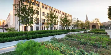
In order to harness the heritage of the local area, it was decided that the outdoor spaces should centre around garden squares. Yet GP+B were acutely aware that London is no longer a city of top-hatted flaneurs and sooty artful dodgers. The traditional square, whose austere iron railings erected social as well as physical barriers, had to be dragged into the 21st century. ‘London is an evolving city,’ Porter reflects. ‘It’s one that has changed dramatically since the 18th century. That modernity is what attracts people to London. It’s a very forward-looking city. And we thought the square needed a rethink. So pulling down the metal railings, the barriers that stop people entering, was one gesture – to allow people to move through, to experience the idea of being in a relaxed planted green space. That’s something that Londoners really appreciate in a frenetic city. These are the starting points for our thinking. How to contemporise, keep up with change, and make London a special place.’

While GP+B recognised that three squares – Whistler, Mulberry and Garrison – would become the heart and soul of the Chelsea Barracks site, they realised that ‘those three spaces all had very different characters’. There was no attempt to homogenise; rather, the firm embraced each square’s unique identity. As a major entry point from Pimlico Road, GP+B felt Whistler Square should pull people into the Barracks, and so installed a 20 metre-long, curved water scrim – a fine layer of water which flows on top of the pavement. ‘We’ve got the wonderful Conrad Shawcross sculpture that really announces the entrance into Chelsea Barracks, and then beyond that the long elongated form of the water scrim that will act as a mirror, transforming that space, pulling light into the heart of the square’ Porter explains. ‘That was our big change from the original masterplan: to move it from something that was quite traditional in character, to something that represents a sculptural quality. By putting the mirror in, it suddenly makes the landscape almost as important as the architectural frame in which it’s placed. It gives a completely different scale. The ground has depth, as it reflects the sky and everything around it. That natural way of collaging life into the surface of the space is really important. It will reflect people, it will reflect the plants that surround it, and it will bring life into the space. That was very important for us – to brighten up everyone’s experience.’
Neil Porter

We see Mulberry Square not just as a culinary garden, but as this extraordinary kinetic artwork.
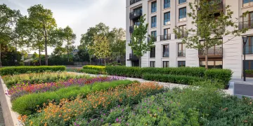
What’s more, the magnificent water scrim draws pedestrians into the heart of Chelsea Barracks, pointing them towards Mulberry Square – soon to be reborn as what Porter describes as a ‘refined version of an allotment’. ‘We, with the master planners, rethought Mulberry Square as a contemporary culinary garden, almost like the kitchen garden of a grand estate where you would find the flowers, the medicinal plants, the vegetables and herbs that provide food and colour for the family home,’ he says. ‘So the culinary garden evolved into an incredibly spectacular array of plants. You don’t get that in a garden square.’

Indeed, the garden square wasn’t the only aspect of Chelsea’s cultural legacy that influenced GP+B’s landscape design. Realising that the area’s status as an artistic community played an important role in its development, the firm felt the landscape should reflect contemporary art themes in London. ‘We looked at artists like Bridget Riley and others who would really be able to inform our landscape language,’ Porter explains. ‘We see Mulberry Square not just as a culinary garden, but as this extraordinary kinetic artwork. Evergreen hedges, laid out in their rows, will be the strong frame in winter, but when spring, summer and autumn come along, we’ve got these incredible layers of different coloured plants and vegetation popping up between the hedges.’ By placing such a stunning garden within a residential context, GP+B are encouraging passers-by to appreciate the glory of nature’s transience, and take joy from the subtle, seasonal shifts that often go unnoticed. As Porter puts it, ‘in the relaxed environment of a residential community, maybe there is that opportunity to sit on a bench and observe what’s happening around you.’ GP+B ’s kaleidoscopic culinary garden means plenty will be happening around Chelsea Barracks – ensuring that residents can rely on nature’s constant companionship.

That said, Mulberry Square will serve the Barracks in more than an aesthetic sense; indeed, its herbs and flowers should prove a treat for the tastebuds as much as the eyes. GP+B saw that Garrison Square – with the chapel, restaurants and other developments – would become ‘the public heart of the Chelsea Barracks experience,’ and so decided most of the vegetables and herbs should be planted where Mulberry and Garrison meet . ‘There is an active plan for the restaurant to use that garden space as a resource for cooking, which is great,’ Porter reflects.
Yet for GP+B , the conspicuous innovations are as important as the eye-catching ones. Neil was clear on the importance of the new design feeling ‘seamless with its context’: plants, for example, were dug into the ground rather than lifted above it, establishing an authenticity with the environment. The car park and energy centre are tucked away underground , while the curve in the Whistler Square scrim was specifically designed to ‘relax the space’. ‘Small devices like that really make a difference to the quality of a public realm space – a space that people want to use and feel comfortable in,’ Porter explains. Clearly, he and his team are stretching the traditional parameters of urban landscapes – effortlessly fusing enchantment and functionality, bringing the past into glorious conversation with the future. Neil reflected that Chelsea Barracks have ‘built up a wonderful story,’ and there can be no doubt that GP+B have provided a thrilling final chapter. The traditional garden square – so central to Chelsea’s history – has been transformed into an engaging and utterly modern space. Hugo had it right: Somewhere to walk. Somewhere to dream. What more can one ask?


