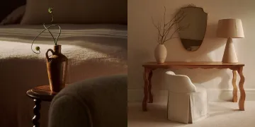
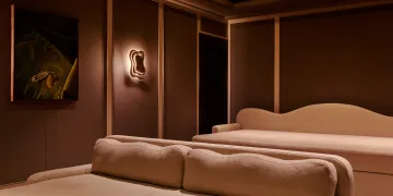
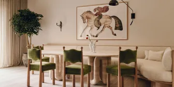
In the world of interior design, minimalism has evolved beyond trends to establish itself as a timeless and sophisticated approach to crafting an elegant living space. One often underappreciated and even misunderstood aspect of minimalist design is the use of colour. Minimalism is not necessarily about absence but rather a precise and deliberate attention to the finer details.

While instinct may suggest that a minimalist design would only allow for whites, greys and other muted tones, this is a myth Banda is eager to dispel. Banda has been appointed to design the interiors for Chelsea Barrack’s 4 Mulberry Square Townhouse, the interior designer experts are renowned for their minimalist approach. Ele Besoonjen, senior interior designer at Banda, says that incorporating colour into minimalistic designs should be done by ‘being intentional through carefully chosen accent pieces’.
The purpose, Besoonjen explains, is to introduce personality, intrigue and depth to a space. The key is in selecting not just colours but also textures that provide a cohesive and calming atmosphere.

Banda looks to achieve a balance with their minimalist designs; beginning with a neutral base to build on and then working up. Warm neutral tones and whites provide a perfect blank canvas to layer colours onto, with distinct furniture pieces and larger elements providing a suitable accent that will not distract or disturb.
Minimalism requires you to consider the space around an object as much as the object itself. The use of negative space should be carefully considered as it allows key elements in the room to ‘stand out and breathe’.

Subtle introductions of colour can help to elevate the appeal, interest and depth of a room without overwhelming the space. Consider incorporating throw pillows, artwork or decorative items to inject vitality into your room. Combined, these elements work in harmony to enhance the personality and breathe life into every corner.

For those looking for a more bold interpretation of minimalism, look at single statement pieces such as vibrant sofa or accent wall. As Banda stated, though, moderation is key. “Let the statement piece be the hero of the room” is the ethos to hold. The bold colour should remain the protagonist and speak for itself and avoid getting crowded by other bright and garish hues.

Incorporating more natural tones helps to bring a sense of warmth and tranquillity to minimalist designs. Soft greens, warm browns and calm blues all establish an organic connection while maintaining simplicity. Natural materials like wood and stone elevate the organic colour palette and create an interior that's both luxurious and visually enthralling without being ostentatious. 4 Mulberry Square from Chelsea Barracks fully embraces these natural elements, with wooden handrails and stone fireplaces enhancing the minimalistic aesthetic while still perfectly cultivating a personality of refinement and sophistication.

Mastering the use of colour as a minimalist demands a thoughtful and intentional approach. Understanding the power of neutral shades, incorporating monochromatic accents, displaying an understated boldness, embracing negative space, and integrating natural elements collectively contribute to a space that is both elegant and timeless. The art lies in the ability to elevate simplicity to new heights, resulting in an interior that is both understated and captivating. Minimalism is not about having as few items as possible. It is about having the exact right amount.


