We met with Charu Gandhi, the founder of celebrated interior design studio Elicyon, to hear about her most recent exhibition of work in ‘STEEL’, one of three show apartments Elicyon have designed at Chelsea Barracks. So named due to the industrial influences throughout the design stimulated by the history of the neighbouring Chelsea Bridge. Charu described the project as ‘the best work [in my opinion] we have ever done’ and with such resounding praise, we were keen to delve into her thoughts on the process of delivering and dressing a new home, how the trends in interiors have evolved over the past decade and where her inspirations come from.
You are, first and foremost an architect, that must provide a very useful foundation of knowledge when it comes to interior design, how do you marry the two?
I have established a ‘form follows function’ approach to design at Elicyon, it’s an architectural approach. As a studio I wanted to deliver Beautiful and creative work but if design is not done with process and rigour, the quality won’t be there in delivery. Creativity is at the heart of what we do but my background in architecture has proven priceless. The approach at Elicyon has come after a great number of learning curves, as there are with every project, but one in particular stands out, One Hyde Park – it was a very tricky building within which we had many different clients.
What inspires you on each project? Is it different each time you begin?
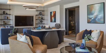
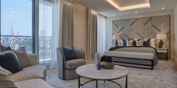
Chelsea Barracks is unique when I compare it to everything else we have done in the world of new build residential homes, and we have done many! The sheer amount of open space across the development translates into the interiors, there is a vast amount of space to work with which gave us more creative freedom. For Steel - the amazing lateral views, in one direction towards the royal hospital Chelsea and in the other, Belgravia, this had to be our inspiration and starting point.
What was your approach with the residences at Chelsea Barracks, each one is so different?
Our work at Chelsea Barracks has been the most creative we have ever done for a show apartment. Qatari Diar allowed us to create a story, a narrative for these apartments and follow through with a theme so it’s been one of the most design driven apartments we’ve done; most are driven by programme and budget. This is the best work, in my opinion, we have ever done, but then it is our most recent work – I always think our most recent work is our best!
STEEL follows a distinct theme or narrative; can you tell us about the idea behind the cool colours and bronze details that run throughout?
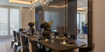
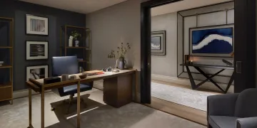
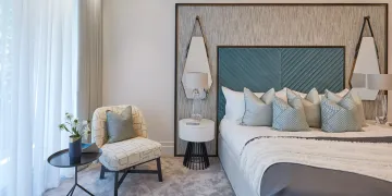
These apartments have character, the traditional stone check pattern hallways, high ceilings and coffers but in principal the base is neutral so you can take it in many directions. Firstly, we investigated the history of the site, and the local area was formative in creating the concept for this design. We have used many blues from pale midnight to shades inspired by the Chelsea Pensioner’s navy undress uniform. The blackened bronze accents that you can see throughout the design, most notably in the bespoke dining room chairs, add an unexpected industrial twist which was inspired by the nearby Chelsea Bridge.
There is certainly a harmony to the space but the design also acknowledges that people come with antiques or pieces of furniture they want to incorporate into new design so we tried to create sleek contemporary aesthetics with vintage pieces dotted throughout; vintage inspired chandeliers and some mid-century furniture.

Is a consistent scheme an interior design ‘must do’ for people in general or is this approach specific to a show home?
There is deliberate and intentional continuity throughout this apartment. For me, a home should not feel staccato. Its more enjoyable if it feels like a symphony, so there are places of interest which are punchier, and places of complete calm but overall, it’s a harmony. The mind’s eye if you repeat certain elements and colours or tones, you mind gets accustomed and feels quiet and at home. Of course, a funky children’s room or cloakroom should be included, but overall it should feel continuous, so you settle in. This is often, specifically, what our clients are looking for when they hire an interior designer, the continuity of space throughout the home – the harmony.
You touched on the trend favouring vintage, can you tell us about the changes in trends over the past decade amongst your UHNW clients?
A decade ago, when we were working on the likes of One Hyde Park for example, the brief and desire was for a much more luxurious, opulent look and today, in 2019, that is not the right approach. I think that approach would feel very neuveau and quite crass today. There is a shift in luxury. What we have delivered at Chelsea Barracks is more representative of today and more aligned with the brief of our private client. Of course, some clients like opulence, metal detailing, onyx bathrooms, back-lit stone but generally this is a shift towards comfort, texture, pattern and craft, more fun interiors I would say. Today design is more than designer, its understated, it’s subtle, it’s a definite human change.
And yes people are much more open to vintage, they are thinking more about art too and in general, have a lot more interest in colour which I particularly enjoy – much has changed!
Does an art collection dictate design more today than it has done previously; do you create design concepts around art?
Well, very often for private clients, are asked to curate an art collection. But other times, yes, art pieces can dictate the design. Personally, I would tell clients that a home and interiors shouldn’t feel like a stage set, it shouldn’t all be “matchy matchy” – the most beautiful interiors are where the art doesn’t match the interiors but they are aware of it, or acknowledge it, otherwise it can feel quite contrived. The art can be an afterthought and that’s okay. knowing where the art is going to go on the other hand, is important.
Finally, STEEL showcases a number of decorative items throughout, how do you curate these so it doesn’t become ‘stage set like’ and feels like a home?
At Chelsea Barracks we went to a new set of suppliers for decorative items, we have never bought this quantum of dressing and we really didn’t want it got feel as if we went and bulk bought. I think in total we have used 620 suppliers at Chelsea Barracks. We asked is it purposeful, is it beautiful we wanted the architecture to speak for itself and not distract from it. We applied the Marie Kondo method!
We used a small quantum of books and applied a sculptural approach to the dressing, ceramics and carefully placed objects, it’s not crowded. No pictures frames as I don’t like them in show apartments, I find that can look like a stage set. We took lot of time of dressing and carefully selected the pieces; they are all very individual and each beautiful, as they would be in a person’s home. People curate over the course of their life and we wanted to reflect that.
Ultimately, this is a place where people will live, it’s not a hotel. It should be beautiful and comfortable in equal measure and I think we have achieved that in STEEL. I would happily live here, in fact, I would love to live in this apartment, I can imagine being here with my own family.


